Visualizing OLS Linear Regression Assumptions in R
While most of the time it’s sufficient to programmatically validate your model assumptions, sometimes it’s helpful to visualize them. Here are a few quick ways you can do just that.
Linearity
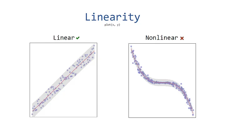
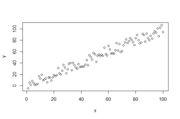
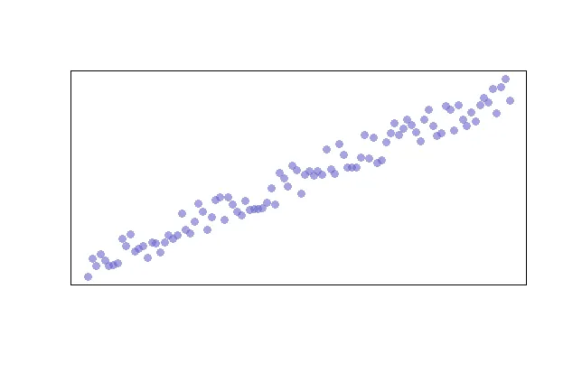
Linearity is likely the easiest assumption to visualize as you can simply use the following code snippet to quickly create a scatterplot.
plot(x, y)
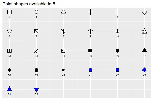
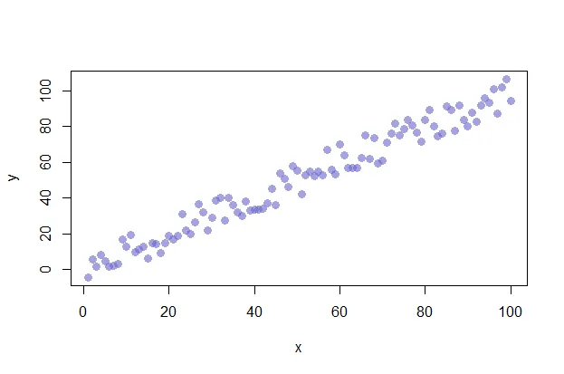
Additionally, you can alter the appearance of your points by using the “pch”, “cex”, and “col” options. PCH stands for Plot Character and will adjust the symbol used for your points. The available point shapes are listed in the image below.
The “cex” option allows you to adjust the symbol size. The default value is 1. If you were to change the value to .75, for example, the plot symbol would be scaled down the 3/4 of the default size. The “col” option allows you to adjust the color of your plot symbols.
plot(x, y, col=rgb(0.4,0.4,0.8,0.6), pch=16, cex=1.2)
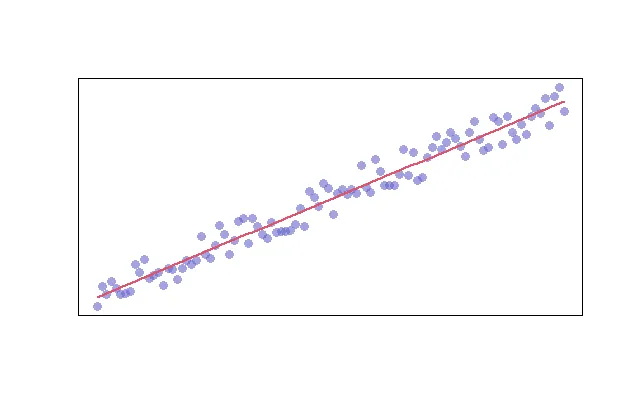
You can adjust the axes with the “xlab”, “ylab”, “xaxt”, and “yaxt” options (amongst other available options). In the following example we will remove the axes altogether.
plot(x, y, col=rgb(0.4,0.4,0.8,0.6), pch=16, cex=1.2, xlab="", ylab="", xaxt="n", yaxt="n")
Finally, you can add a trend line by creating a model and adding the fitted values to the graph. We’ll also adjust the line width and color with the “lwd” and “col” parameters, respectively.
model <- lm(y ~ x)
lines(model$fitted.values, col=2, lwd=2)
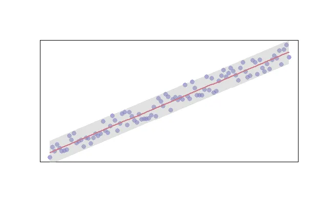
Alternatively, you can enrich your data with limits by using the predict function as shown below.
# create your model
model <- lm(y ~ x)

# predict your model
predict_model <- predict(model, interval="predict")

# plot your raw data
plot(x, y, col=rgb(0.4,0.4,0.8,0.6), pch=16, cex=1.2, xlab="", ylab="", xaxt="n", yaxt="n")

# get the index of your data
ix <- sort(x, index.return=T)$ix

# add your trendline
lines(x[ix], predict_model[ix, 1], col=2, lwd=2)

# add a shape to represent your upper and lower limits
polygon(c(rev(x[ix]), x[ix]), c(rev(predict_model[ix, 3]), predict_model[ix, 2]), col = rgb(0.7,0.7,0.7,0.4), border = NA)
Multicollinearity
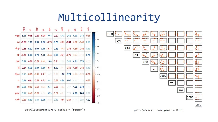
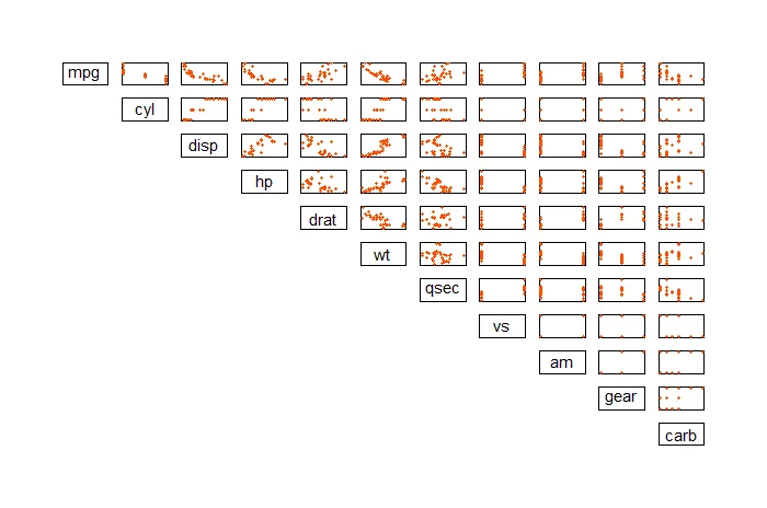
The first way you can visualize multicollinearity is through a plot matrix via the “pairs” function. You can test this out on the “mtcars” dataset as follows:
pairs(mtcars, pch=20, lower.panel=NULL, xaxt="n", yaxt="n", col="#FC4E07")
The second way you can visualize this is through a correlation plot. First, install the “corrplot” library then use the “corrplot” function.
library("corrplot")
corrplot(cor(mtcars), method="number")

Autocorrelation
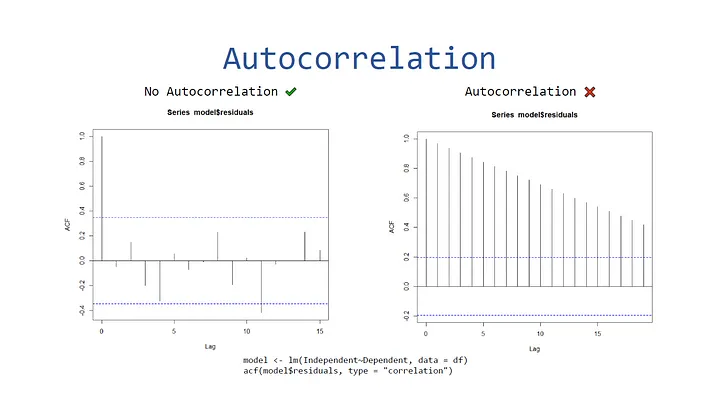
To visualize autocorrelation, you can create an autocorrelation plot via the acf function in the stats library.
library(stats)

model <- lm(mpg~drat, data=mtcars)
acf(model$residuals, type="correlation")

Here’s an example of a plot with data that does contain autocorrelation:
